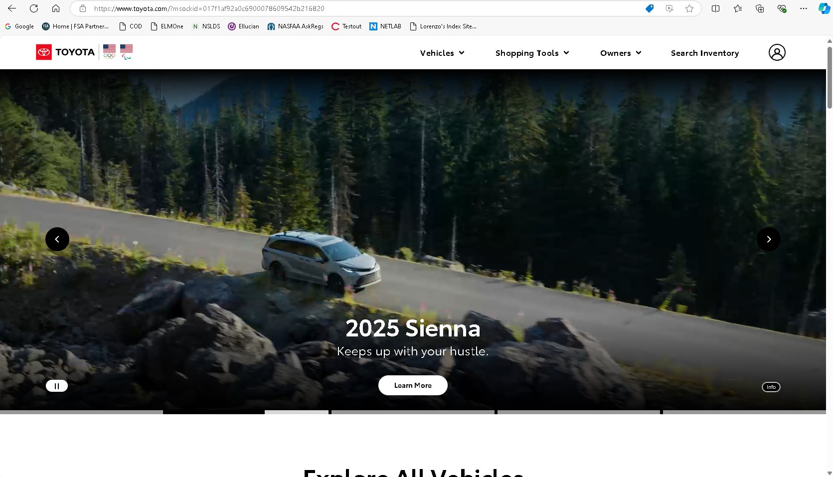
The Toyota webise desing gives me a good example of the "show dont tell" desing element. They have a series of images front and center displaying their products. They dont show a lot of text. Their navigation is clear and easy to access by just having the links on the top right of the page. The design is optimized for different screen widths, I dont find myself having to scroll sideways or with images or sections of the site being cropped off when the window gets slimmer.
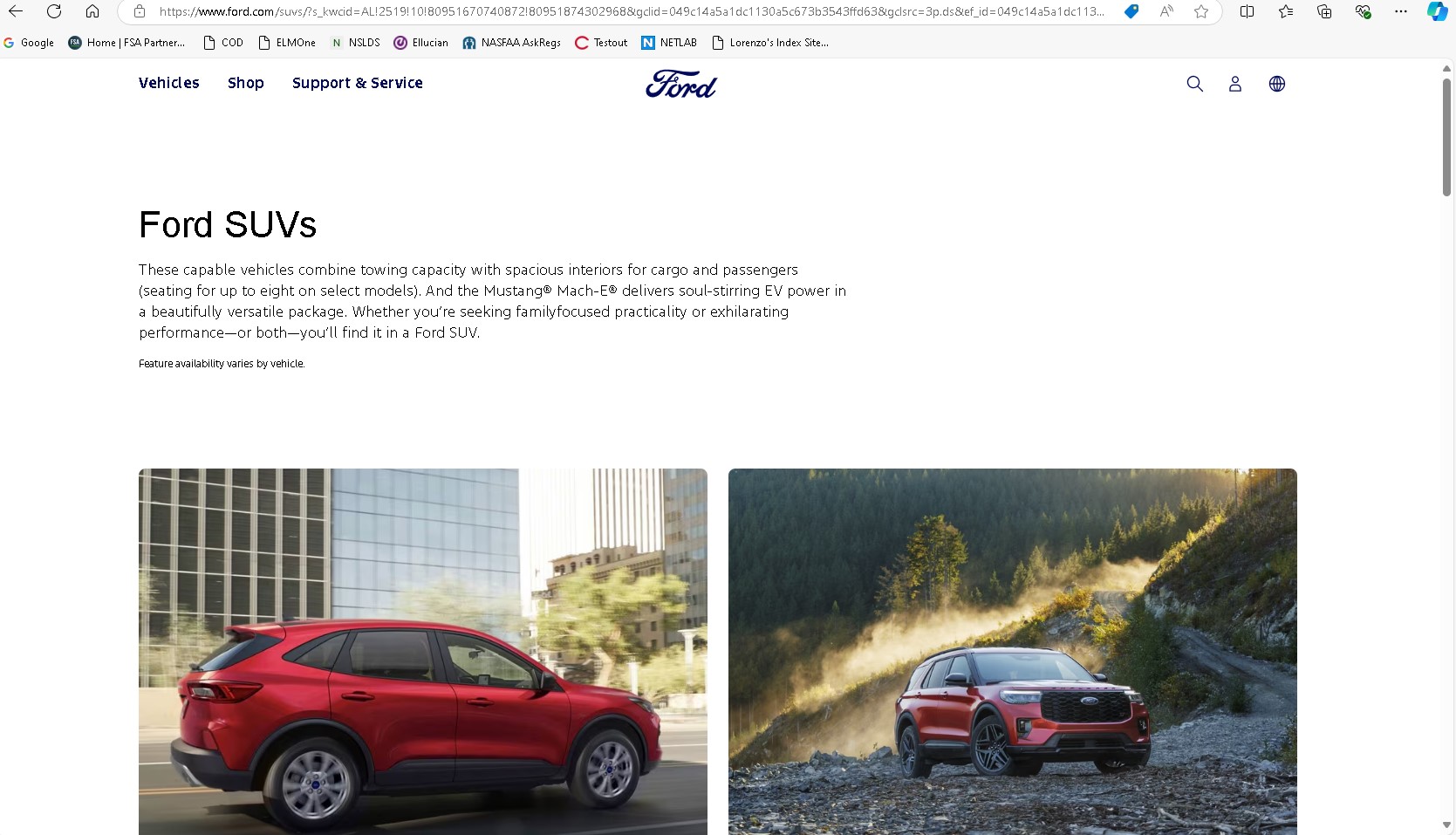
Ford is a major competitor for Toyota when it comes to vehicle sales in the US. Their website design is very similar in some aspects to the Toyota one. The navication is simple. I like their placement of their logo right on top and center. Their color pallate uses a white background which makes the text easy to read and the pictures pop out in the page.