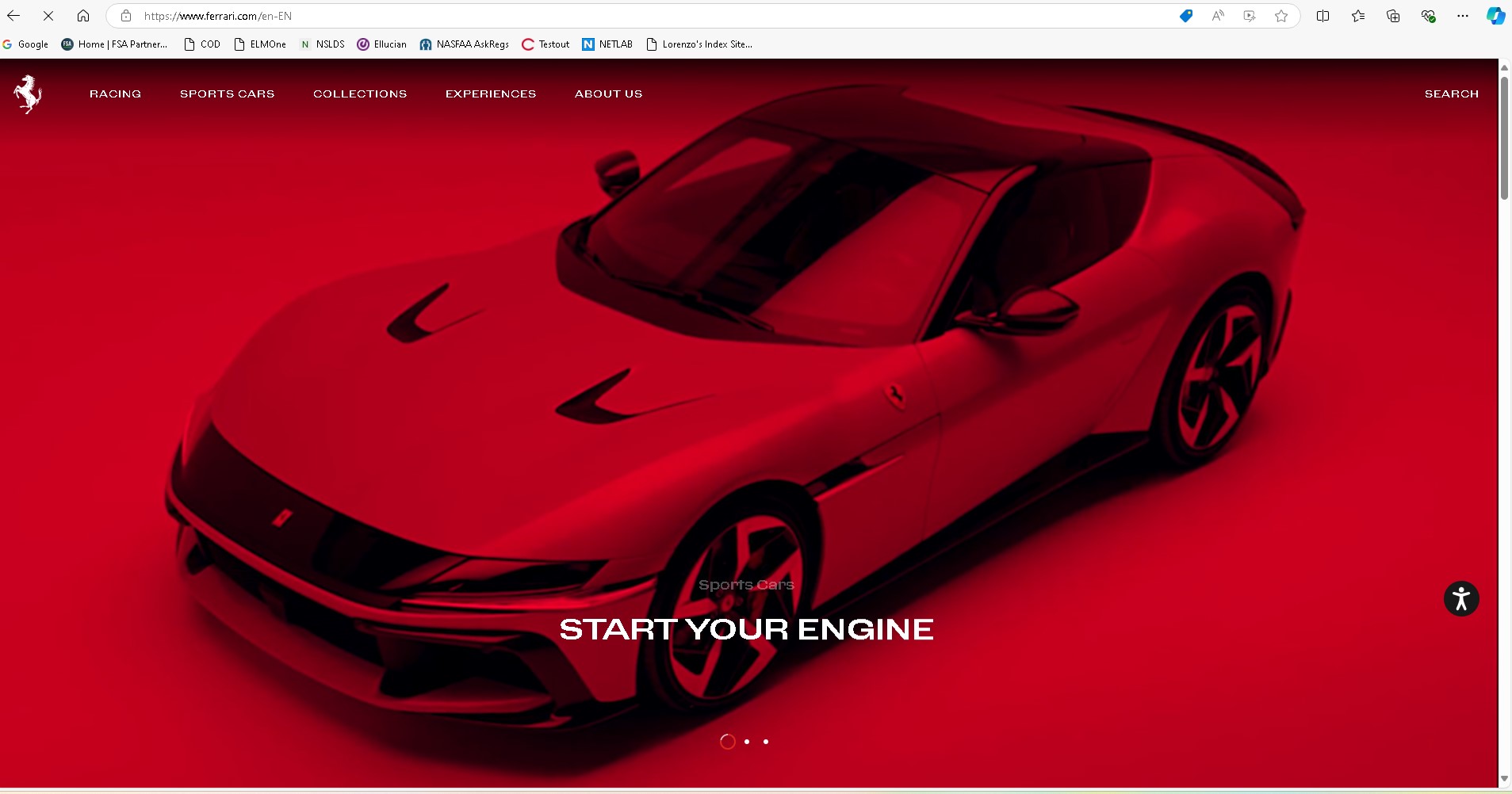
Use visuals to tell your visitor what you are about. Using good imagery will help make a good first impression. In the ferrari website as soon as you land it hits you with imagery representing the brand, and before you can even look away you are hooked
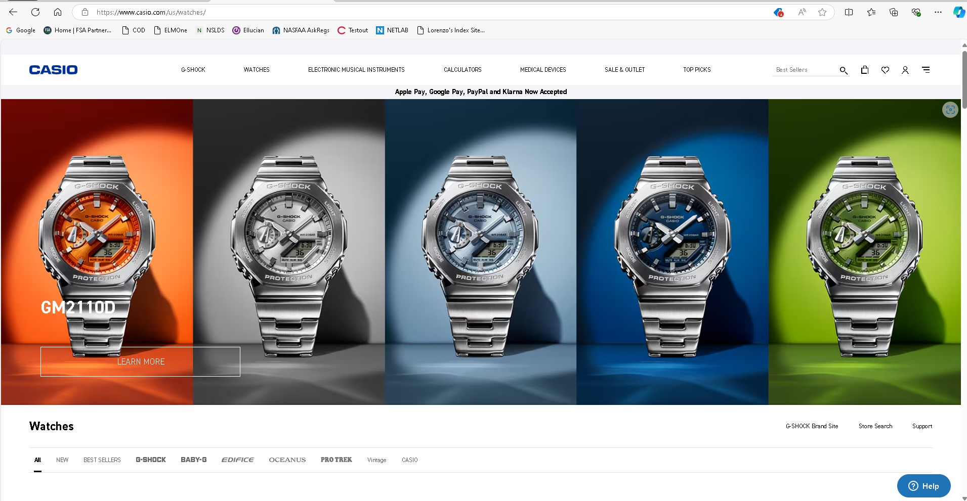
Be intentional with the words on your page. Use little but usefull text. I like Casio's simple web page design, it has little text but each word is a link and it takes you to that models part of the site.
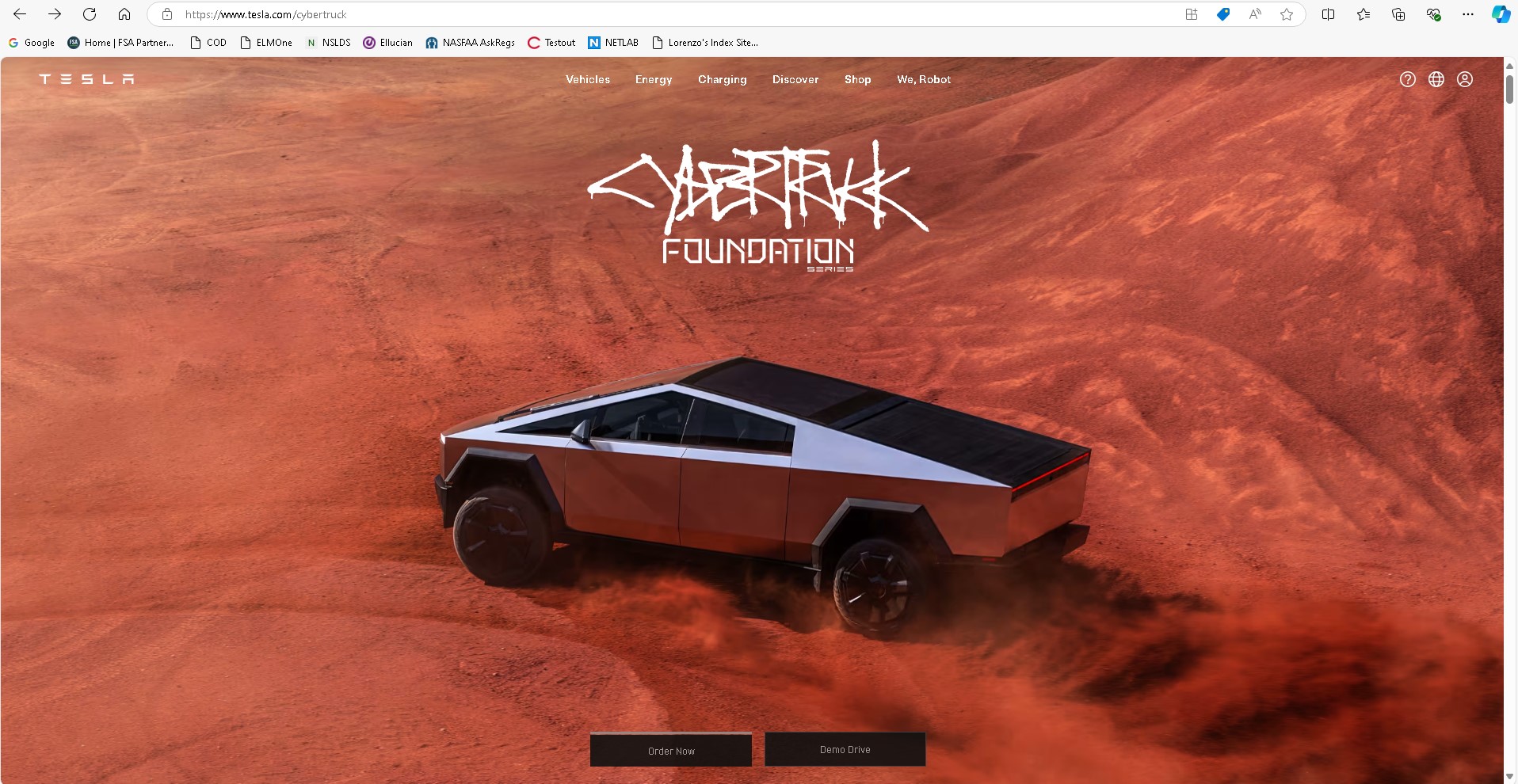
Making your website easy to navigate gives your visitor a better overall experience and increases your chances of them staying. Teslas site is so easy to navigate, choose a model and all you have to do is scroll down to read more about it. You are ready to order your car? just click the order button that is always present.
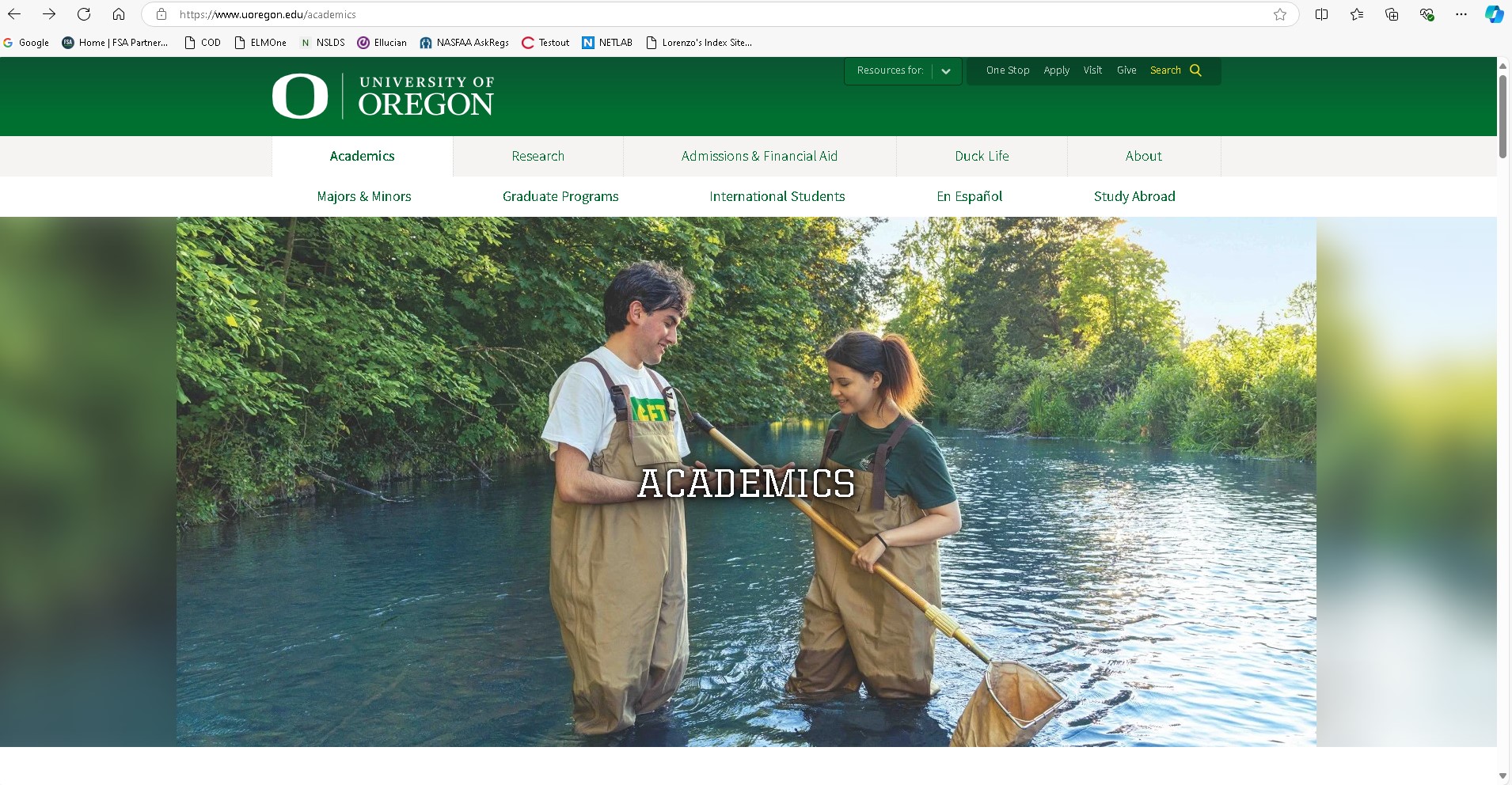
Using colors that represent your brand on your webiste will give the visitors a sense of familiarity. When desinging your website make sure to use a color palette that matches your logo. This desing element made me think of the UofO website. Green banners, green and yellow text all match the schools colors.
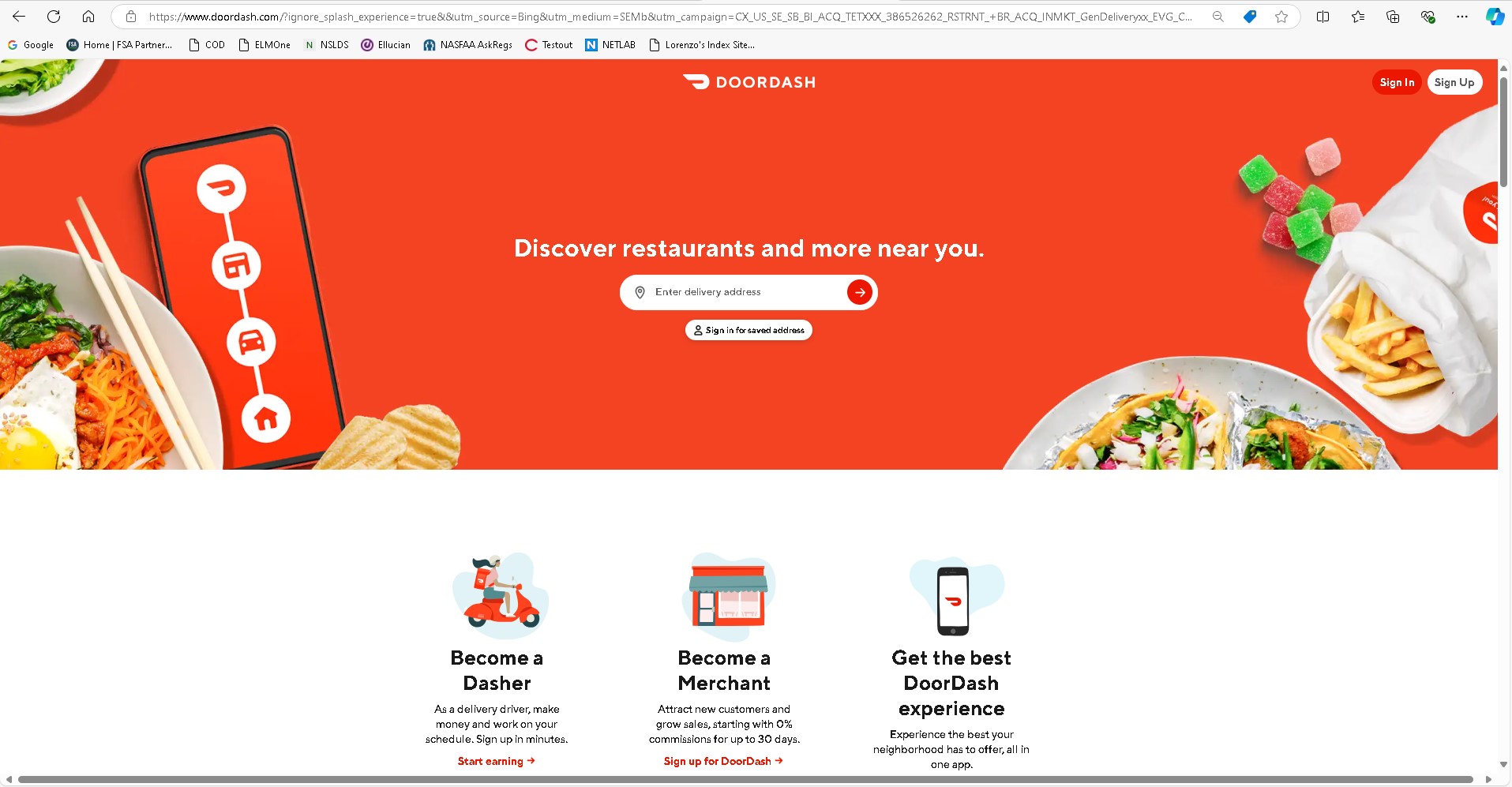
Ensuring users have easy access to your call to action element is very important when designing your webiste. When a visitor lands on your page they should be able to quickly find what you hope they are there to do. I like doordash's page because you could be visiting the site for different reasons but they have a quick way for you to access what you need. Are you wanting to place an order? right there! interested in signing up as a delivery driver? right there!
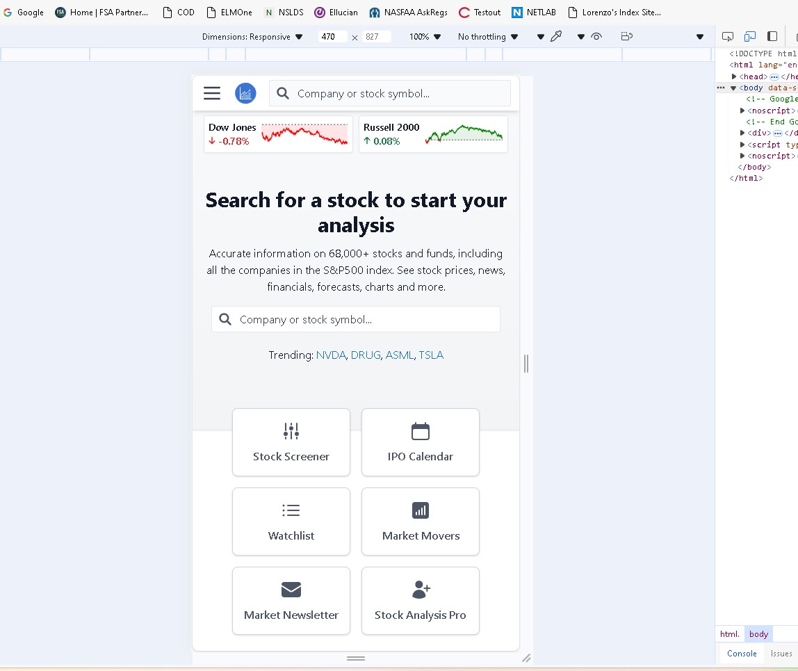
Having a website that can look good and be usable while accessed through a mobile device is an important design element. A user that might be trying to access your company website might be discouraged to do business with you if they have a hard time navigating while using their mobile device. I like using stockanalysis.com to read their news section and look at their feed, for a website who is mostly made out of text i though they did a great job in the way the site is diplayed on mobile.